Avira | Website
Avira Checkout Redesign
Transforming a fragmented purchase flow into a confident, human-centered checkout experience.
Transforming a fragmented purchase flow into a confident, human-centered checkout experience.
What if buying antivirus software felt as smooth and secure as using it? That question guided the Avira Checkout Redesign: a complete overhaul of the purchase flow from product selection to payment confirmation.
The old checkout worked technically but demanded too much from users. It had too many pages, unclear feedback, and little reassurance at the moment of payment. After reviewing user analytics, we discovered that 26 percent of users abandoned checkout before completing payment, and the average time to purchase was over two minutes.
The goal was to simplify, clarify, and build trust. After redesign and rollout, checkout completion time dropped by 30 percent, abandonment decreased by 22 percent, and conversion improved by 18 percent among new users. The new flow didn't just look better. It felt effortless and trustworthy.
Current Avira Website Checkout Screen
I led the end-to-end design process of the checkout experience, from early research and concept sketching to final high-fidelity design and handoff. My responsibilities included mapping user journeys, identifying pain points in the existing flow, and defining the new information architecture.
I created wireframes, prototypes, and conducted usability tests to validate design decisions at every stage. Collaboration was key. I worked closely with the product manager, developers, and analytics team to align on user needs, technical feasibility, and conversion goals.
Beyond visual design, I also drove discussions around UX principles and data-led decision making, ensuring the final experience was both elegant and measurably effective.
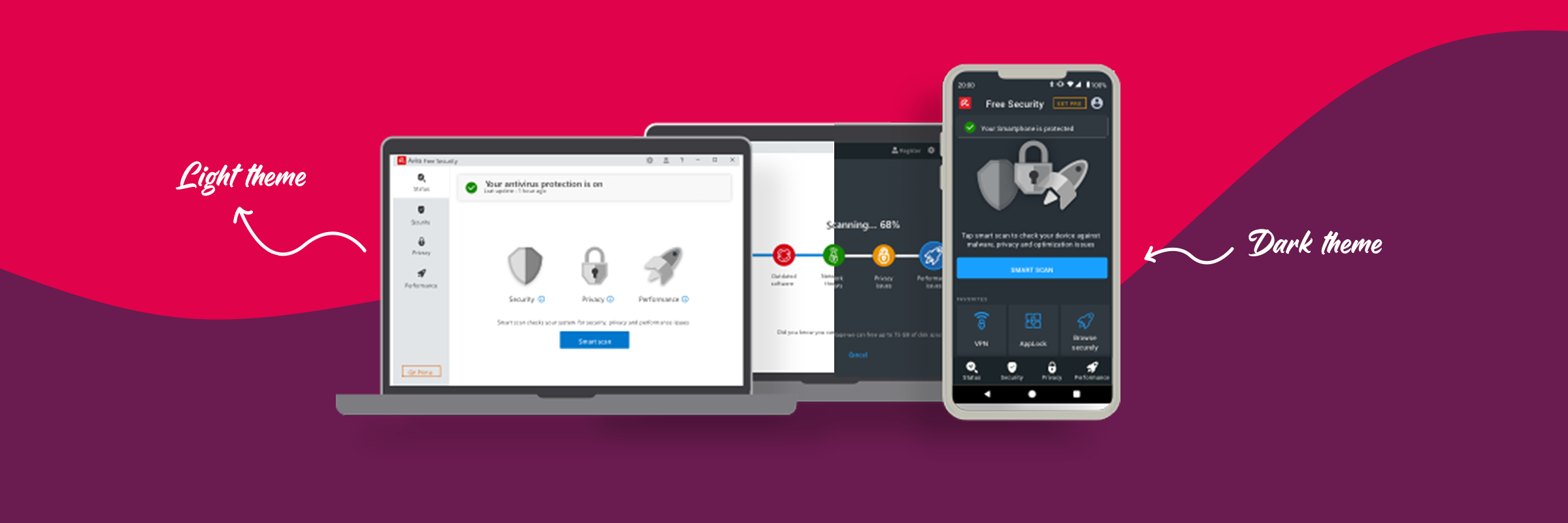
Avira is a global leader in cybersecurity, trusted by over 500 million users worldwide. With more than 30 years of experience, Avira provides powerful yet lightweight security solutions designed to protect users' devices, privacy, and data across all major platforms including Windows, macOS, Android, and iOS.
The company's products combine advanced malware protection with performance optimization and privacy tools, all built on a foundation of transparency and user trust. Avira's mission is simple: to make digital life safer, faster, and worry-free for everyone.
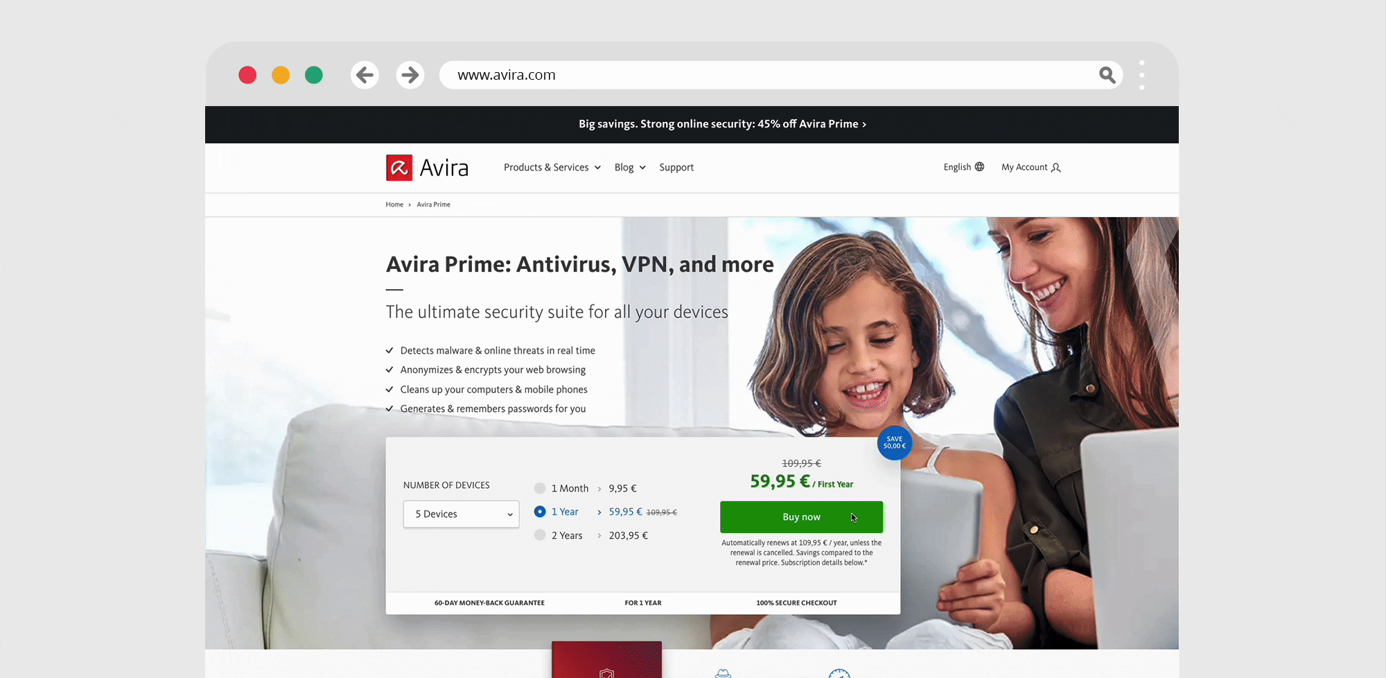
The original Avira checkout experience used by 50 million people every year reflected legacy design patterns that were no longer aligned with user expectations. It was serviceable, but not intuitive. Each step asked for a small leap of effort, and together those leaps added up to fatigue.
The previous checkout was spread across multiple screens: cart, address, payment, and review. Each page reloaded and reset the user's context. According to Hick's Law, every additional step increases the time it takes for users to make a decision. The experience forced users to think more than they needed to, and it showed in drop-offs between steps.
Critical actions like "Next" or "Buy now" were buried under dense text blocks and legal information. The eye had to work to find the next step. The visual rhythm was flat, and nothing anchored attention where it mattered most.
Error states simply turned fields red without explanation. Users were left to guess the problem, sometimes re-entering information multiple times. There was no inline validation, and no sense of momentum as they filled out the form.
Product details and pricing disappeared midway through checkout. Users had to recall what they were buying and for how much. That broke flow and created doubt. It went against Jakob's Law, which reminds us that users expect consistency, meaning they want to see familiar elements and information persist across steps.
Security and guarantee badges appeared inconsistently and far from the payment buttons. Entering credit card data without visible reassurance made users hesitate. This was a crucial psychological gap at the point of conversion.
When I was checking out, I kept wondering if I had done something wrong or missed a step. It didn't really feel like a secure or modern purchase process. Participant from user testing

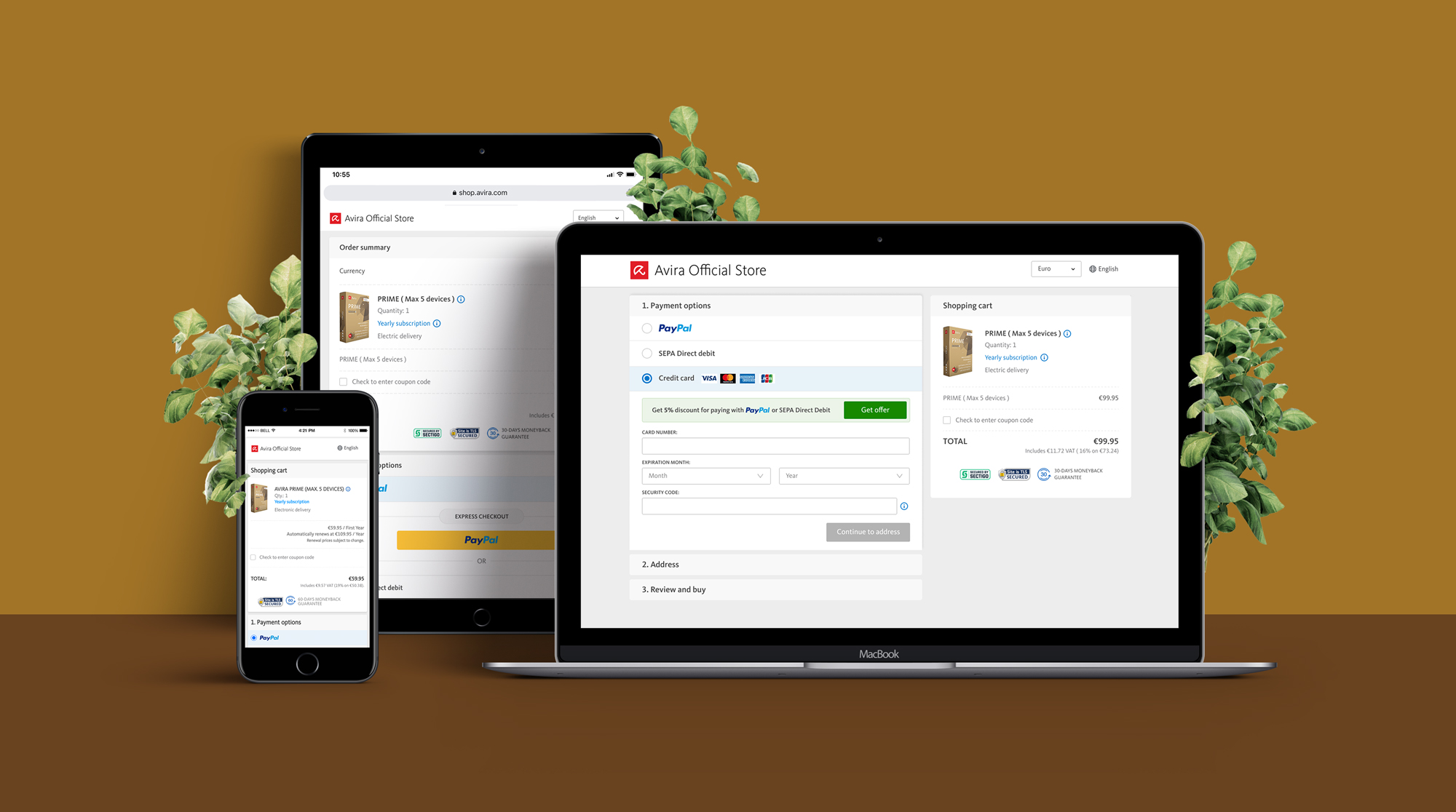
Avira Old Multi Page Checkout Experience
The goal was to rebuild the checkout around clarity, trust, and speed. We aimed to reduce friction, reinforce confidence, and make payment completion feel simple and safe.

Hearing from all the stakeholders
During the early design phase, the biggest challenge was balancing simplicity with visibility.
An early prototype explored a single long-page design where all fields appeared in one continuous scroll. It looked minimal but overwhelmed users in testing. They couldn't tell where to start or how much was left. On the other hand, keeping multiple pages felt dated and slow.
The breakthrough came when we combined both ideas: a three-step accordion layout within one frame. Payment, Address, and Review each opened and collapsed in sequence. This structure created a sense of linear progress without page reloads. It also allowed us to test each section independently for performance and clarity.
This approach embodied the essence of Miller's Law: people process information best when it's grouped into manageable chunks. Three focused steps were easier to complete, and psychologically more satisfying.
The new checkout lives entirely within a single, stable layout. On the left, users progress through the accordion steps. On the right, a persistent summary shows the product, price, and guarantees. The experience feels anchored, familiar, and calm.
Each section expands smoothly as the user completes the previous one, offering a clear sense of progress without interruption.
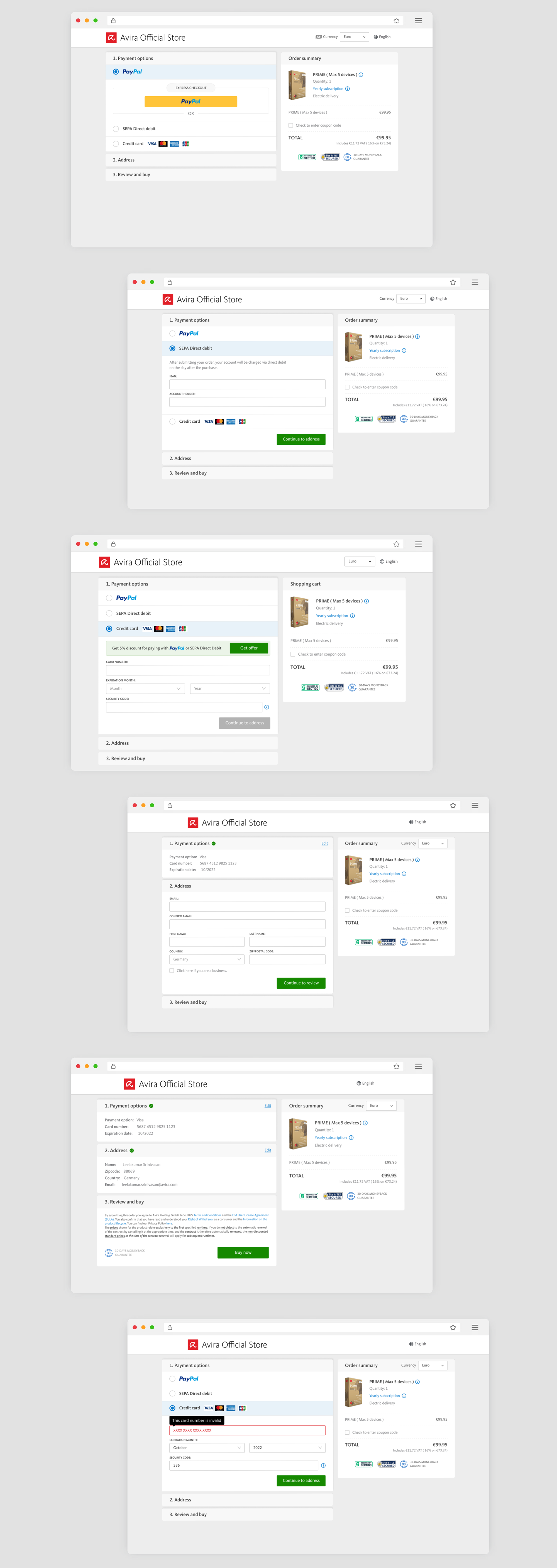
New one page, 3 step checkout experience
The new accordion structure replaced the old multi-page navigation. Users no longer have to load new pages or lose orientation. This design leverages Fitts's Law, which emphasizes minimizing movement and effort to speed up interaction. By keeping all actions close together, we reduced completion time by nearly one-third.
The order summary remains visible on the right throughout the checkout. Users can see what they're buying, the total price, and the guarantees at all times. This consistency directly reduced hesitation during payment. It also supported Nielsen's principle of Visibility of System Status, which emphasizes keeping users informed to build trust.
We restructured the visual layout to emphasize the journey's primary actions. The "Continue to address" and "Buy now" buttons use strong contrast and clear placement, while legal text was visually toned down. Each section now has a clear visual anchor, reducing eye strain and uncertainty.
Form fields now respond immediately. Errors are explained as they occur, not after submission. This change improved completion rates and user confidence. It aligns with Error Prevention principles from usability heuristics, encouraging correction before frustration sets in.
The three-step structure limits mental effort and keeps users in rhythm. They only focus on one type of task at a time: first payment, then address, then review. By aligning with Miller's Law, we reduced cognitive load and helped users maintain focus from start to finish.
Security badges, payment logos, and guarantees are placed directly beside the total cost and final "Buy now" action. This small change improved perceived security scores in testing and increased completion confidence. Eye-tracking studies show that placing trust cues near CTAs increases conversion by 10-15 percent.
We introduced a friendly incentive: a 5 percent discount when choosing PayPal or SEPA Direct Debit. This small behavioral nudge leverages the psychology of Reciprocity, rewarding users for preferred actions while creating positive reinforcement.
The new review section is concise and editable. Users can quickly verify or adjust details without leaving the page. The design creates a feeling of momentum, and once they reach the final step, they almost always finish. This aligns with the Zeigarnik Effect, which suggests that incomplete tasks naturally motivate users to complete them.
After implementation and testing with a representative user group, the improvements were both measurable and visible.
These numbers validated that the redesign not only worked visually but also functionally. The experience now feels modern, intuitive, and consistent with Avira's identity as a security brand built on trust and simplicity.
The Avira Checkout Redesign turned a dated, fragmented purchase process into a confident, human-centered experience. Every design decision, from the three-step flow to persistent visibility and real-time validation, was driven by user data and psychological insight.
By applying proven UX principles like Hick's Law, Fitts's Law, and Miller's Law, we built a flow that feels faster, simpler, and safer. The results speak for themselves: fewer drop-offs, faster completions, and a more trustworthy brand experience.
In the end, this project reinforced a core design truth: when users feel confident, they complete the journey, not because they have to, but because they want to.
Get in touch with me to discuss projects.