Umbrella | Mac, Windows, iOS, Android
Umbrella: Design System
A unified design language for Avira's multi-platform security products.
A unified design language for Avira's multi-platform security products.
Umbrella began as Avira's internal design system: one brand, one component library, primitive tokens wired directly into components. It solved the immediate problem of consistency across Avira's platforms. But as Gen Digital's multi-brand portfolio expanded, the approach that worked for one brand started showing its limits.
Over time we rearchitected the token model, introduced a semantic layer, and built a themer that lets any designer switch any screen between brands and modes instantly. What started as a single-brand system became a shared core that all six Gen Digital brands draw from, each with their own visual identity, but all maintained in one place.

The first version of Umbrella solved a real problem: Avira had grown across Windows, macOS, iOS, Android, and web with no unified visual language. Components looked slightly different everywhere. Design and development time was wasted recreating the same patterns repeatedly. Umbrella brought consistency and a shared component library that teams could actually use.
But primitive tokens wired directly into components only work for one brand. When we needed to produce Avira's flows for partner brands, the process was manual: duplicate the file, re-skin every component by hand, maintain two separate libraries going forward. That does not scale. The evolution to semantic tokens and a themer was not a redesign for its own sake. It was a direct response to a real operational problem that was already slowing teams down.

I led Umbrella across its full lifecycle, from the initial build through to the multi-brand architecture it became. In the early phase that meant auditing existing components, establishing the grid and spacing system, defining typography and color, and working with developers to align the component library with the engineering framework so handoffs were clean.
As the system matured and Gen Digital's brand portfolio expanded, my role shifted toward rearchitecting the token model and introducing the semantic layer. I worked with the team to define what belonged in primitives versus semantics, authored the per-brand config files, and oversaw the integration of the themer into our Figma workflow.
Throughout both phases I was responsible for governance and adoption: setting contribution criteria, running cross-platform audits, and reporting system health to product and engineering leadership.
From the start, we defined six values that the system had to deliver on. These were not aspirational statements. They became the criteria we used to evaluate every decision, from token naming to component structure to how we handled brand variants. The semantic token architecture and themer we built later were a direct result of taking "Design Scalability" and "Brand Consistency" seriously enough to re-examine how the system was built.
The user experience of our product or service must be friendly towards users using assistive devices and technology. Unlike usability, accessibility focuses on people with disabilities and impairments. Many users will face challenges due to demanding contexts. Designing for all ability levels means choice. All products should support all accessibility technologies of their platform.
Around 8% of people have some sort of sight deficiency. Test for accessible contrasts, colors, and sizes when designing user interfaces. While handling this issue, we need to make sure that the other 92% of our users still enjoy a beautifully designed solution.
In Umbrella design system, we highly value usability because it matters. If users cannot achieve their goals efficiently, effectively and in a satisfactory manner, they are likely to seek an alternative solution to reach their goals. And for websites and apps, alternative solutions are abundant. That is why we finalised on the three pillars below to structure our design system.

Workshop for Umbrella design system
The extent to which a product can be used by specified users to achieve specified goals with effectiveness, efficiency and satisfaction in a specified context of use. ISO 9241-11
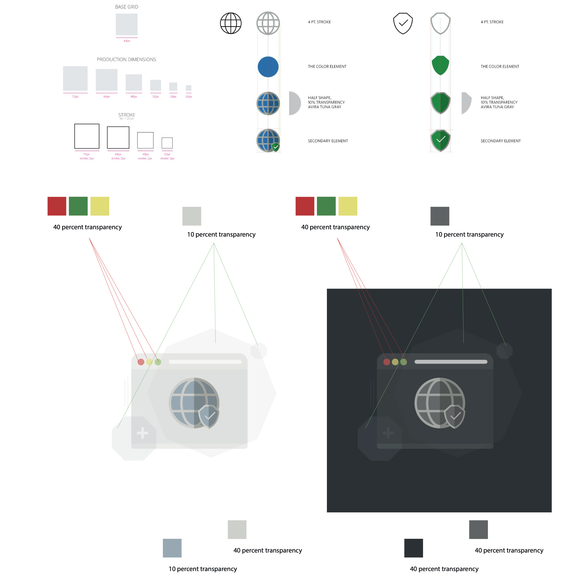
You don't start building a house without its foundation so the same thing applies to design systems. The foundation of a design system is your spacing and grid system. I feel like spacing and grids are some of the most overlooked elements when it comes to visual design but they can make a huge difference in the look and feel of a design.
For this project I went with an 8pt grid system that consists of a 12-column grid and an 8px baseline grid. For the spacing system I went with a rem-based guide that aligns with the 8px grid. The reason why I went with an 8pt system is to help the design system be more responsive because all of the top screen sizes are divisible by 8 on at least one axis. This is important as it will help prevent anti-aliasing.
Umbrella Layout & Grid based on 8px

Windows, Mac, iOS, Android and Web views

Light vs Dark theme


Color Pairs

Typography
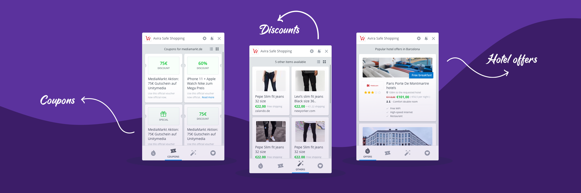
Avira's symbols and components are based on a larger vision of the product which is ever expanding and growing many folds. Our symbols are not only simple and neat but functional. Design systems are complex, but making clear rules and defining them in a clear and easy way for the developers to understand and implement with minimal or no help is the key to our successful design system.
The Umbrella Design System builds on top of the operating system. Our buttons come from the Operating System. On Windows our buttons look like Windows 10, but are custom elements; on macOS they are macOS native UI components. On Web we use the custom elements we use on Windows.

The Avira feature icons have been uniquely created to build a greater brand consistency. The master files are pixel-perfect files; the icon suite can be applied across all digital platforms for all necessary applications. The examples below illustrate some of the principles that have been considered to reflect the Avira brand. When implementing, please ensure you use the correct size version to maximise clarity.
Some of the product icons
To enable greater flexibility with Avira's brand assets, the feature and product icons can be modified to create illustrations that best represent the message and content. It is important that the illustration elements derive from our master icon set. However, there may be instances that original assets have to be created to help build stories.
To help build these illustrations into compositions there are some basic principles which provide layers of complexity and depth. The below guidance explains these established principles and of course these can be optimised using animation and applying to other content such as infographics when required.
Breaking the illustrations
Motion in the Umbrella design system is based on 5 pillars: Direction, Duration, Interaction, Response and Transition. Understanding what these pillars are and how they can help users interact is key to achieving a responsive UI.
It is essential to achieve 60fps or more in any animation. Motion at lower fps levels makes the application look stuck and unresponsive. To achieve this target, use OS-level APIs to ensure the use of hardware-accelerated animations. If necessary, simplify the animation. A great start is to avoid rendering fonts in every single frame; try to only animate simple shapes. Animating text will almost always lead to a bad user experience at low frame rates.


Direction

Duration
Interaction

Response

Transition
Umbrella launched with primitive tokens wired directly into every component. A button referenced color.red-500. A surface referenced color.neutral-100. For a single brand this was fine: fast to build, easy to understand. The problem surfaced the moment we needed a second brand. Every component had to be opened and re-mapped by hand. Dark mode required the same exercise again. It did not scale.
We restructured into two distinct layers. Primitive tokens define the raw palette values and never change when a brand changes. Semantic tokens sit above them and define what things mean: this is the primary action color, this is a danger surface, this is secondary text. Components reference only semantic tokens. The brand config beneath resolves each semantic token to the correct primitive for that brand. Swap the config, the whole system re-skins.
Brand-agnostic raw values. Every possible color, spacing step, radius, and type size lives here. These never change when a brand changes. They are the palette, not the decisions.
color.red-500
color.neutral-100
space.4 · radius.md
Meaning mapped to primitives. A semantic token like color.action.primary does not know what color it is. It only knows it is the primary action color. Every component references this layer exclusively.
color.action.primary
color.surface.danger
color.text.secondary
A JSON file per brand that maps each semantic token to the correct primitive. Avira maps action.primary to red-500. A different brand maps the same token to their own color. One file per brand. No component changes required.
avira.json
norton.json · avast.json
bullguard.json (sunset)
With the token layers in place, we built a themer directly into our Figma setup. A designer selects a brand and a mode from a dropdown. Every screen in the open file instantly re-renders in that brand's visual language: colors, surface treatment, elevation, border radius, and type all resolve through the correct brand config automatically.
There are no duplicate files. There is no per-brand Figma library to maintain. A designer working on Avira's onboarding flow can switch to Norton's version of the same flow in seconds, verify it looks correct, and hand off both in a single session. What previously required a separate project file and a separate designer now takes one dropdown change.
Gen Digital manages a portfolio of six consumer security brands. The traditional approach is a separate design system per brand: six component libraries, six token files, six sets of documentation, six review cycles every time a pattern changes. The overhead compounds fast.
Umbrella inverts that model. There is one component library. One set of patterns. One accessibility standard. One documentation site. Brand identity lives entirely in the config layer. Each brand has its own color, surface, radius, and typographic treatment, which keeps them visually distinct and true to their individual brand guidelines. But the structure underneath is shared.
When we improve a component, every brand gets the improvement. When we add a new pattern, every brand inherits it. When we fix an accessibility issue, it is fixed across the whole portfolio simultaneously. The work happens once. The benefit lands everywhere.
Buttons, inputs, navigation, cards, dialogs, status indicators. Built once, tested once, deployed across every brand and platform. A fix or improvement ships to all six simultaneously.
Each brand config controls color, surface tone, border radius, elevation, and typographic weight. Norton looks like Norton. Avira looks like Avira. The system does not flatten them into a generic look.
Product teams can propose patterns for the shared library. Clear criteria govern what belongs in the core versus stays local. This prevents fragmentation without creating a central bottleneck.
One library to version, one changelog to write, one set of developer specs to maintain. Teams spend less time on system upkeep and more time on product work that moves the needle.
Maintaining six separate design systems does not make six brands stronger. It makes one team slower. A shared core with brand configs at the edges gives you both consistency and identity without the overhead of duplication.
Get in touch with me to discuss projects.