
Avira | Browser Extension
Avira Safe Shopping is a browser extension that provides contextual deals and coupons based on the pages people browse. The free, discreet add-on that secures your browsing is easy to use, perceived and loved by customers. Additionally, the extension displays the number of blocked ads and trackers on each page. The rest of the time, you won't even know it's there. The browser extension went through a lot of usability changes which helped achieve great results and revenue.

Avira Safe Shopping browser extension showing best offer
I led the end-to-end design and animation of app onboarding slides through research, user testing, wireframing, visual design, motion and prototyping. I collaborated with the Product Manager and stakeholders to identify business goals, user needs and visuals. I worked closely with the development team to ensure the extension is structured, fast and relevant. I made sure at every single stage we have the data and insights we need to make decisions and move forward only after validating with real users. Additionally, I worked on an extension explainer video for first-time users.
The extension was initially developed in the late 2004 with very limited resources. At that time it worked well for users, but after years of service the product really needed a change of direction. We could see our hypothesis proven true when we looked at the revenue and the time users spent on the extension. I identified the areas of improvement and usability issues which needed immediate fixing.

Old Avira Safe Shopping
Though the extension was old enough for a restructure, we were heavily involved in creating Avira Security Suite, which already occupied so much of our time. The situation was not favourable to spend time on a new solution, so I received a "negative" from the stakeholders. However, I had an idea: I wanted to first try a solution which is not drastically different, but only addressing UX issues. This would make sure we have a fix for the immediate UX problems and take time to work on a new and updated solution. We named the project Safe Shopping V1.0. This already helped us improve our conversion and showed better usability in user testing. Sometimes we have to adapt to the business situation and find solutions keeping it in mind.

Updated Avira Safe Shopping V1.0

Updated Avira Safe Shopping V1.0
Additionally, I worked on an explainer video to explain the extension to new users. This was very well received by our users and they could understand the extension even before they interacted with it. From sketching and design to final animation, I created a frame-by-frame storyboard and made sure it is quick, educative and useful for the users.

Storyboard for the explainer video
Extension explainer video done with After Effects
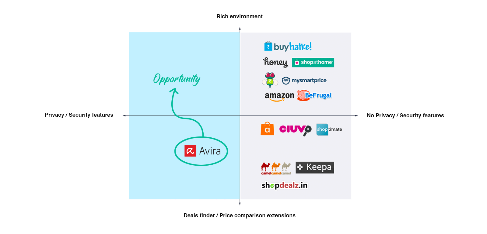
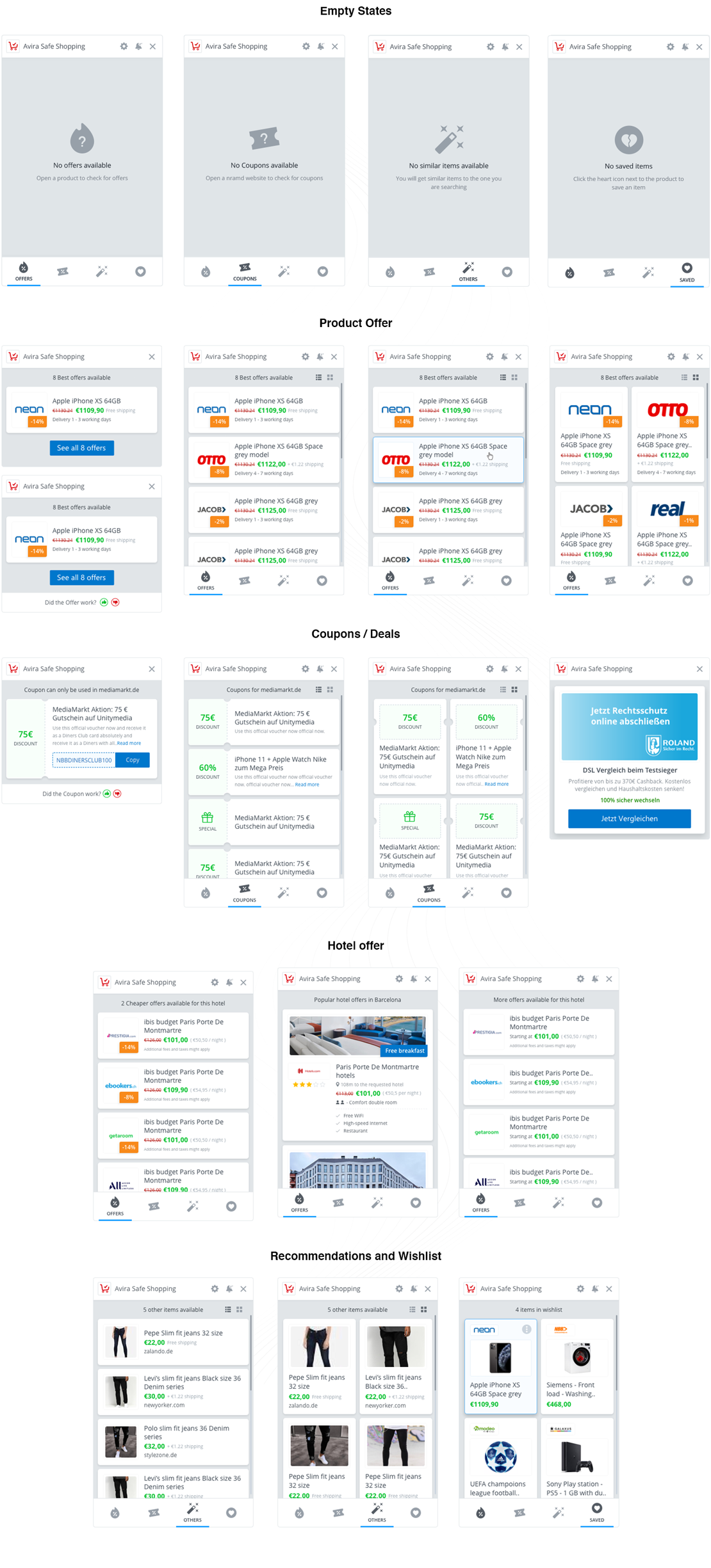
After releasing V1.0 to users, it was time to focus on the larger vision. I put the extension against the competitors and looked at the possible areas we were lacking. I also checked the MixPanel data and noticed the most-used areas of the extension and planned the development accordingly. I noticed the extension is in a unique space, which offers both security and deals compared to our competitors, which was a good balance for the users. It stops malicious and phishing websites, prevents browser hijackings, detects unwanted apps in downloads, and finds the best deals on items you're shopping for. However, the extension lacked effectiveness in terms of offers shown and was not scalable. We also wanted to bring in a new feature called Wishlist, where users can save their favourite items.
I looked at multiple layouts to measure how far each solution was viable. I tried and tested horizontal vs vertical vs banner-like layouts, compared them against each other and decided that the way forward is the vertical layout which has the potential to be a winner.

We explored a horizontally scrollable extension but it was not successful
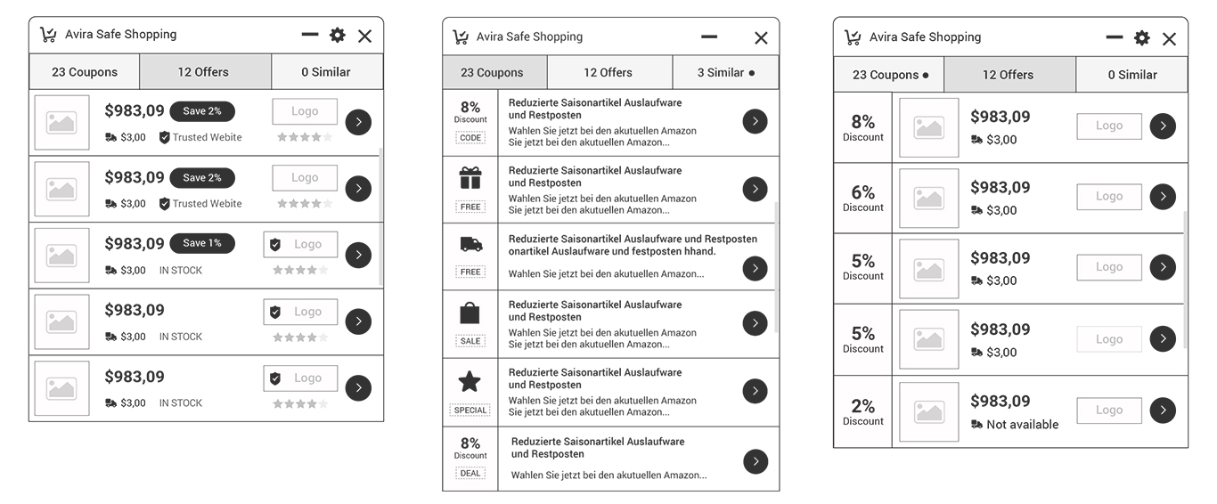
We saw future in this variant, but it needed many changes

Almost the version we wanted to have
We kept iterating on the design based on the feedback from user testing. This helped us arrive at a solution that is nice to look at and also statistically significant. Metrics and data are the drivers for these kinds of solutions. Only with data can we say if the solution is any better.
User experience design is a never-ending process. Product improvements, iterations and reinventing the feature based on the goals set by the team and the market in general is very important. After the launch, we started to ask for feedback from the users who are now using the new solution and tried to identify their pain points. The cycle starts again and that's the beauty of products: there is always scope to get better.
Get in touch with me to discuss projects.
